Use Engagement Data to Make Your Content More Effective
Jackie Logan | Blog, Data & Analytics, Podcasting, Product News
As a content owner, you shouldn’t have to guess what’s resonating with your audience. Understanding how people engage with your content is essential for making meaningful improvements.
That’s where Content Engagement data comes in. Available directly in the uStudio Management Console, it shows how long users stay tuned, where they drop off, and which moments they revisit. Visual graphs and progress-based tracking help you spot what’s working and where there’s room to improve, all based on real audience behavior. This kind of insight is timely, actionable, and tied directly to the content you control.
What Is Content Engagement?
Most traditional communication metrics such as email open rates or web page views only offer a surface-level view. They might tell you that someone clicked, but not whether the content made an impact.
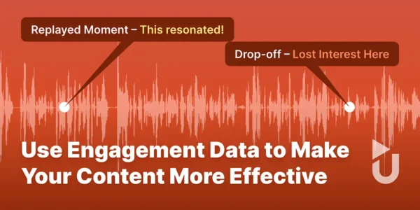
The Content Engagement graph gives you a much clearer picture. It visually maps how your audience interacts with an episode from beginning to end. Spikes show where attention peaks, dips show where interest fades, and replays reveal moments that resonated.
This moment-by-moment view helps you move beyond “Did they press play?” to “Did they stay engaged, and for how long?” That clarity makes the Content Engagement graph one of the most valuable tools for refining content and improving performance over time.
Interpreting Your Content Engagement Data
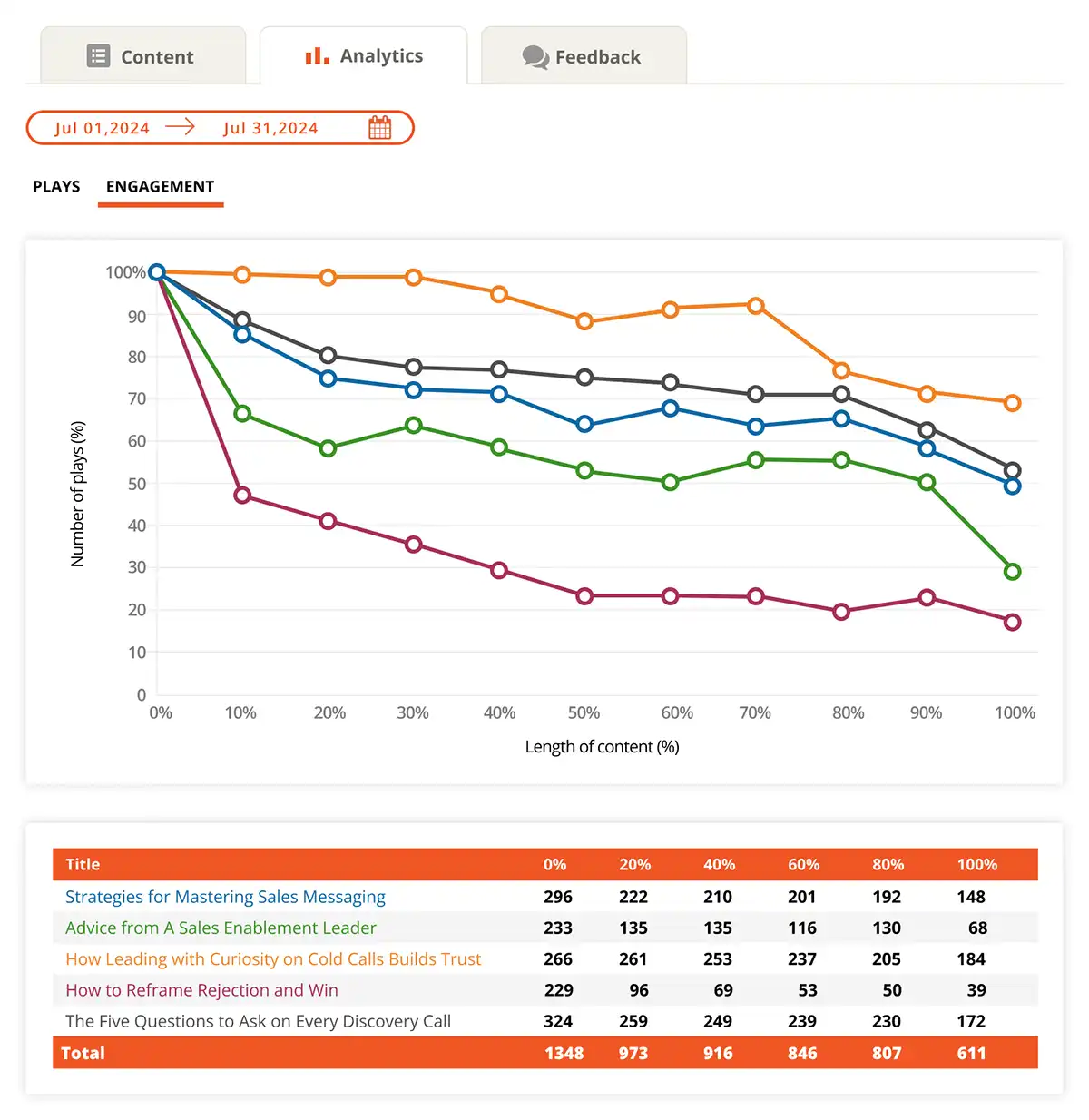
Content Engagement data in the uStudio Management Console is displayed as a combination of a visual graph and a supporting table. Together, they help you understand exactly how your audience experiences each episode.
Understanding the Graph Layout
The horizontal axis represents progress through the episode, normalized into percentages so that episodes of different lengths can be compared. The vertical axis shows what percentage of users are still engaged at each point.
All lines start at 100% because every play begins at the start of the episode. As users drop off, the line declines.
The graph is paired with a table that shows audience retention based on play progress. For example, if you look at the orange line in this graph, you’ll see that at the 80% mark of the episode How Leading with Curiosity on Cold Calls Builds Trust, 77% of plays that started the episode continued to that point. The table provides the exact numbers: 205 plays remained out of the 266 that began the episode.
Reading Typical Patterns
Certain behaviors show up often:
Early Drop-off (0%–10%)
It's common to see a sharp decline early on, often due to:
- Accidental plays from autoplay or browsing
- A mismatch between the title and the actual content
- A slow or unfocused introduction
- Lack of clarity about why the episode matters
- Poor audio quality
Late Drop-off (90%–100%)
Declines near the end are also expected and usually reflect:
- Users getting the main takeaway and moving on
- Recognizable closings or wrap-up segments
- Life interruptions like arriving at work or a meeting
Spotting Key Moments
The most valuable insight often comes from the middle of the episode (10%–90%), where core content is delivered and engagement is earned or lost. Here’s how to read the slope of the line:
- Gradual, steady decline: You’re holding attention well and your content is resonating with your audience.
- Steep drop throughout: Users are tuning out along the way, possibly due to long-winded or repetitive content, lack of structure, or segments that fail to maintain interest over time.
- Sharp dip at a specific point: Something in the content caused a sudden disengagement, like a tonal shift, guest change, or confusing moment.
- Spike upward: A section was replayed, which could reflect especially compelling content or a moment that’s unclear causing users to replay that section for clarification.
To find out what’s driving these trends, replay the episode while reviewing the graph. Seeing and hearing what happens at a spike or drop often gives immediate insight.
Using Engagement as a Feedback Loop
Use this data to improve over time. If engagement consistently fades at a certain point in your structure, consider adjusting your format. If certain sections are repeatedly replayed, you might spotlight or expand on similar content in future episodes.
This pattern recognition helps you shift from one-off content decisions to a repeatable formula that truly connects with your audience.
Putting Engagement Insights into Action
Once you know how to read the Content Engagement graph, you can start using it to make smarter content decisions. Rather than guessing what’s working, you’ll have real behavioral data to guide improvements.
Look to high-performing episodes as models. What about their structure, tone, or pacing might be contributing to strong retention? For episodes with early drop-offs, consider shortening intros, delivering the value proposition sooner, or breaking content into shorter, more focused segments.
Over time, using engagement data as a feedback loop can lead to more consistent performance, better message retention, and stronger outcomes, whether you're sharing updates, delivering training, or driving strategy.
Practical Ways to Improve Engagement
Use these proven techniques to shape more engaging episodes:
Set clear expectations
- Write accurate, descriptive episode titles
- Place content in the right show for the audience
- Include concise, helpful descriptions
Strengthen delivery
- Choose hosts who are clear, confident, and energetic
- Use high-quality audio and video
- Edit out filler and distractions
Structure for retention
- Hook the audience early
- Get to the point quickly
- Wrap with intention instead of trailing off
Learn and evolve
- Review the engagement graph regularly
- Ask for and listen to audience feedback
- Test small adjustments and track the results
Data-Driven Improvements for Maximum Impact
Content Engagement data offers a clear, detailed view of how your audience experiences your content. It helps you understand what’s holding attention, where interest fades, and which moments resonate most.
By using these insights, you can make smarter content decisions, improve structure and delivery, and increase the overall impact of your episodes. Over time, this data-driven approach leads to stronger engagement and a more effective, consistent content strategy.
I am an experienced Go-to-Market and product development leader of SaaS solutions across several industries, both commercial and government. I blend creativity, strategy, and research to launch and evolve products with a knack for asking the right question at the right time to expose unspoken market needs. I leverage my crisp communication skills to organize cross functional teams, manage high-profile client success, and publish public-facing product marketing material.